What is a more Premium MAX?
I worked on all of the research projects involved with the MAX Trainer during my time at Nautilus Inc. The first research project resulted in a basic understanding of the MAX consumer, their needs and identified opportunities for improvement. After the research was finished I transitioned into a creative role within the development team to act as an advocate for the consumer. A small team consisting of Designers, Engineers, the Project Manager and myself came together to complete a sprint to generate solutions to the identified issues and relevant features which would resonate with the Bowflex consumer. This page gives a brief glimpse into what that process was like. To see the research informing this page click here.
My contribution to the MAX Trainer product line included: Brainstorm Facilitation, Feature Concepting, User Research, UX Design
Background
The purpose of this project was to improve the user experience of using the product; specifically issues relating to coaching elements of the console as well as address a consumer desire for a higher price point version of MAX with more premium features. Eager to expand upon the success of the MAX Trainer, the Nautilus Executive Team gave the greenlight for the beginning of development efforts of the next generation of product, the MAX Trainer M7. The major updates for this model were to be:
Improved machine ergonomics
Improved usability of the console and programming
Key features which were identified to help users attain long term success with the product.
- All the above but more premium
Target Persona
To better help guide the team in generating product concepts a Target Persona was created. In this case it was Brooks, a participant from the original research project. These Target Personas were created collaboratively with the Project Manager, sent to everyone on the team and placed publicly within the Design space. The purpose of these posters was to help remind the Design team about our target and their needs. Contents usually included: Research insights, Target Consumer Category, Stage of Fitness, Proposed Value curve of the existing vs new product.
**Face blurred to protect the identities of research participants only for this site.
Deliverable
Before starting a project there would always be a kickoff meeting with Project Stakeholders and management who would help nail down what exactly the final deliverable would need to be. This was important in the success of project to ensure that the Design team has a final target to hit or questions to address. In this case, the deliverable was to be in the form of concept boards with features all targeted at better informing the user and providing a more premium product. Concepts were to include considerations for Aesthetics, Usage Features, Console updates, and mobile device pairing.
Process
Below are the stages and timeline for the overall project. Working around day-to-day obligations from other ongoing projects, the team worked collaboratively through the first two sprints to generate solutions. At Sprint 3 I took the rough ideas and visualized them in a single page format. In Sprint 4 I presented the ideas back to the group and did a series of iterations to better refine the ideas before pitching them to company stakeholders for their review.
Sprint 1: Ideation of themes
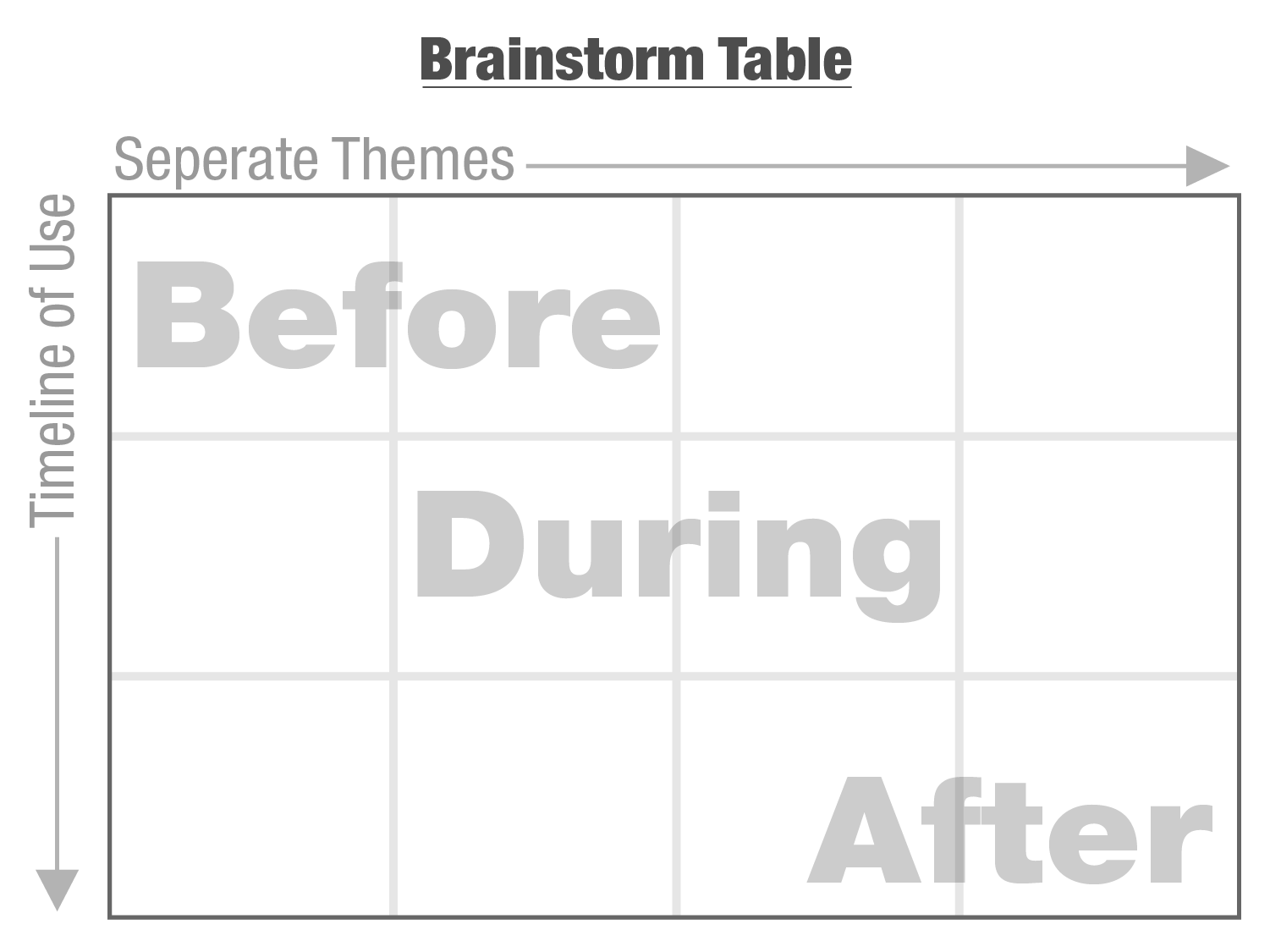
To ensure that ideas are captured and organized as a facilitator, I generally enter brainstorms with a basic table of what I want to accomplish. For this project I used the Table below which I use fairly regularly. Having spent extensive time learning techniques during my education and then professionally facilitating brainstorms in a Think Tank environment, I appreciate the need to be both spontaneous and very organized. I liken it to improv comedy or jazz music. With a structured background a facilitator can be free to pursue interesting topics as they arise but still be aware of the bigger picture and not get sidetracked from the intended purpose of a session. This particular Table was eventually populated by a series of activities which allowed members of the group to generate ideas. These ideas were also then condensed to form groupings which later became themes. I LOVE BRAINSTORMING!
Sprint 2: Exploration:
During Sprint 1 the group was given two separate Target Personas that the Project Manager was considering. As mentioned earlier, Brooks became the final Target persona but having two separate personas early in the project helped the group approach the original question from more perspectives. Fueling this entire process involved a team effort. Throughout the first two sprints, group members were encouraged to do research and bring in inspiration for what they felt to be premium features or products. The group would then share this with the group to spark additional ideas. In the first two Sprints the goal is just to get as many relevant ideas and approaches as possible. Below is a picture after the first brainstorming activity and a condensing of ideas looking for similarities. These groupings became the Themes in the above table.
Below is a picture of these themes now placed within the Table. Often, after the group has created these tables new ideas will begin to flow as the group begins to think of a user experiencing a particular theme and how they might interact with a product.
Sprint 3: Make it Real
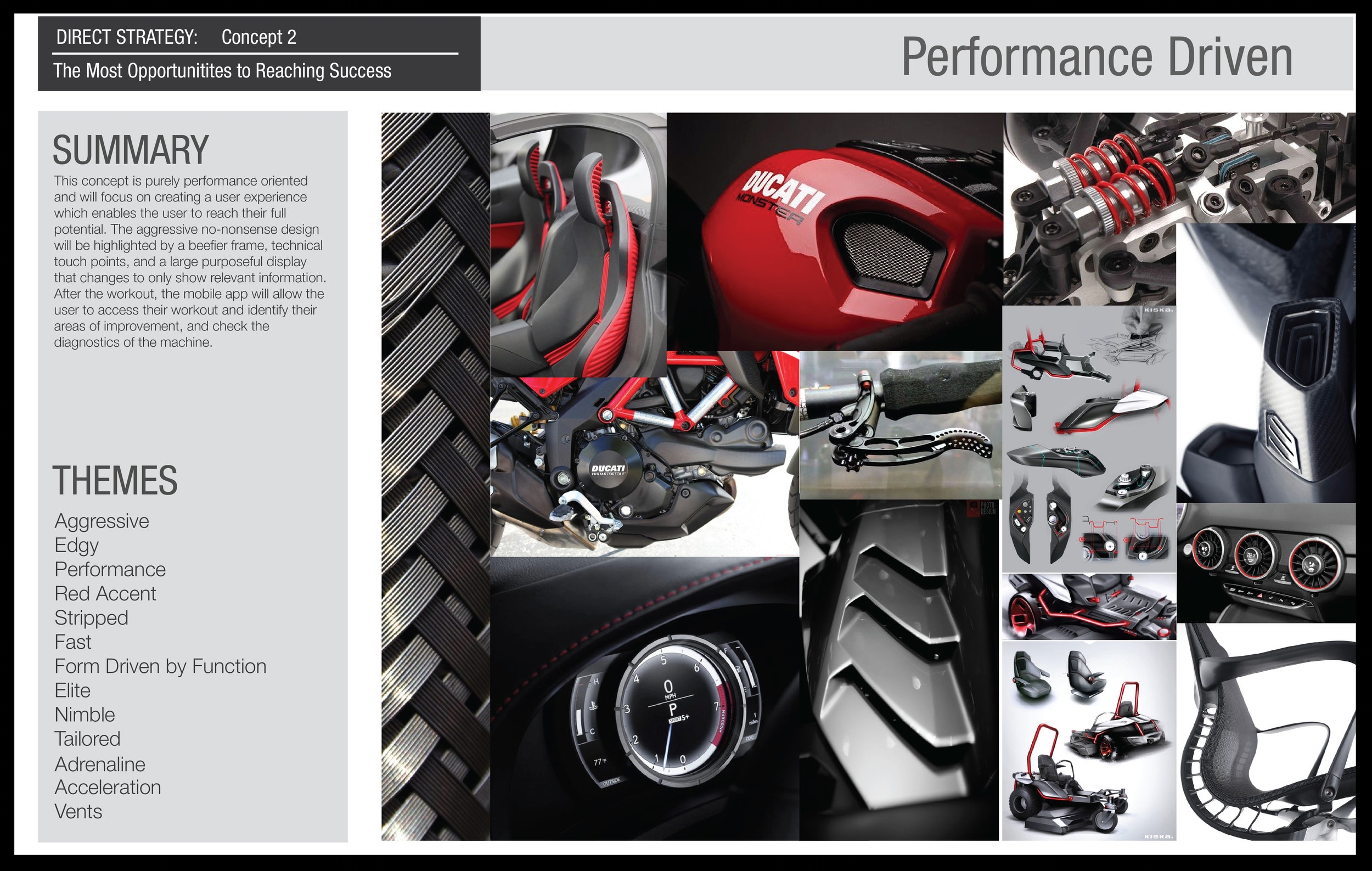
During Sprint 3 the group generally takes a little bit of a break and I need to step up. Having been in the room throughout the brainstorming process I will have captured all the influences that people have talked about and I will have the table. Between these two references and guidance from the Project Manager I will begin creating an abstract one page description of the concept strategy. These pages should include a key phrase associated with the project, a short paragraph summary, a list of one word themes, and a visual mood board. With this page the viewer should have an abstract idea of the feeling of the concept. You can see an example of this page below.
Sprint 4: Lock it Down
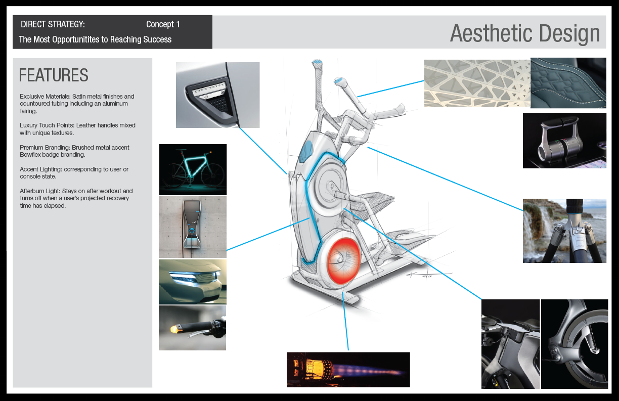
During Sprint 4 I worked quickly with members of the design team to source images and get feedback about the ideas that we had generated. My main goal was to ensure that the original objective was being met, I was presenting the intended ideas of the group members who generated the concepts and that my presentation would make sense to my audience. Below are two concepts which were presented. All final concepts included: a inspirational concept Cover page, aesthetics design, console design, and a mobile application feature which all reflect back to the initial cover page. Two examples can be found below.
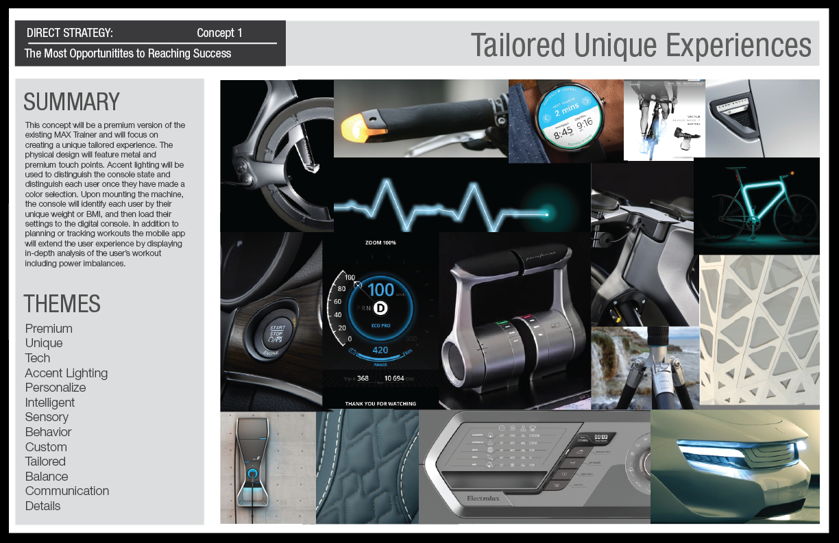
Concept 1
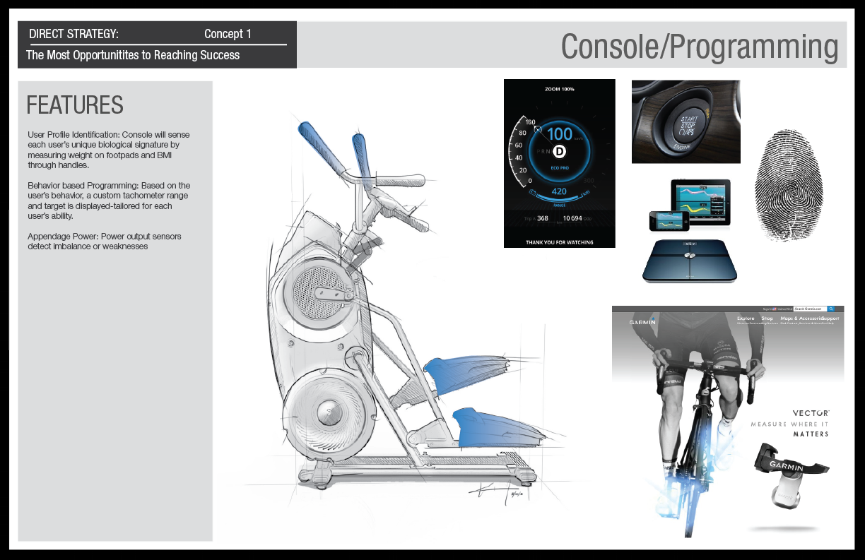
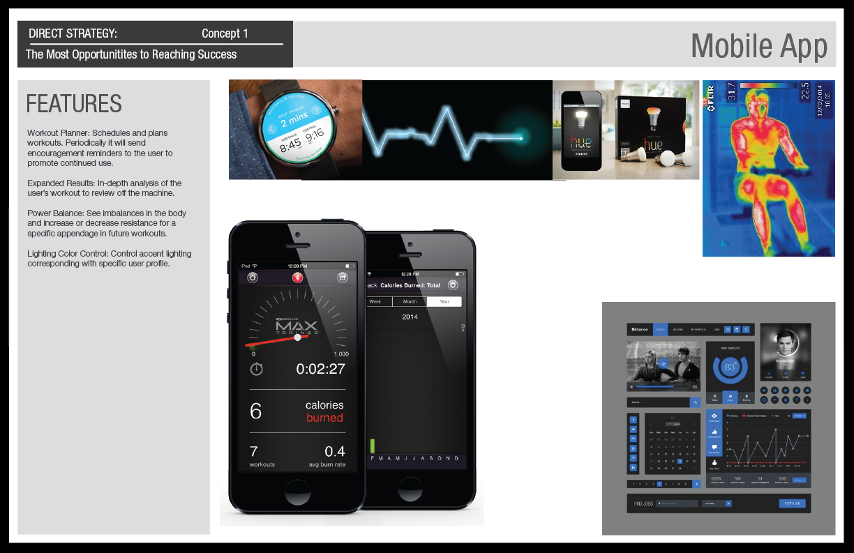
In the field we found that owners perceived their MAX Trainers to be similar to consumer electronics. Concept 1 was meant to enhance the perception that the MAX is a piece of tech rather than just a piece of fitness equipment. Historically, it was always found that users tend to be more successful when they keep their fitness equipment in a visible space within their home. Unfortunately, most fitness equipment is not attractive and therefore ends up in garages or extra less visited spaces. Owners already felt like MAX was attractive and compact enough to keep in their space but we wanted to push this idea even further. This concept featured richer materials, accent lighting that also informed the user about their status, recognized users by their weight and biometrics, measured independent power output by each limb and an app experience which helped integrate workouts into their daily life.
Concept 2
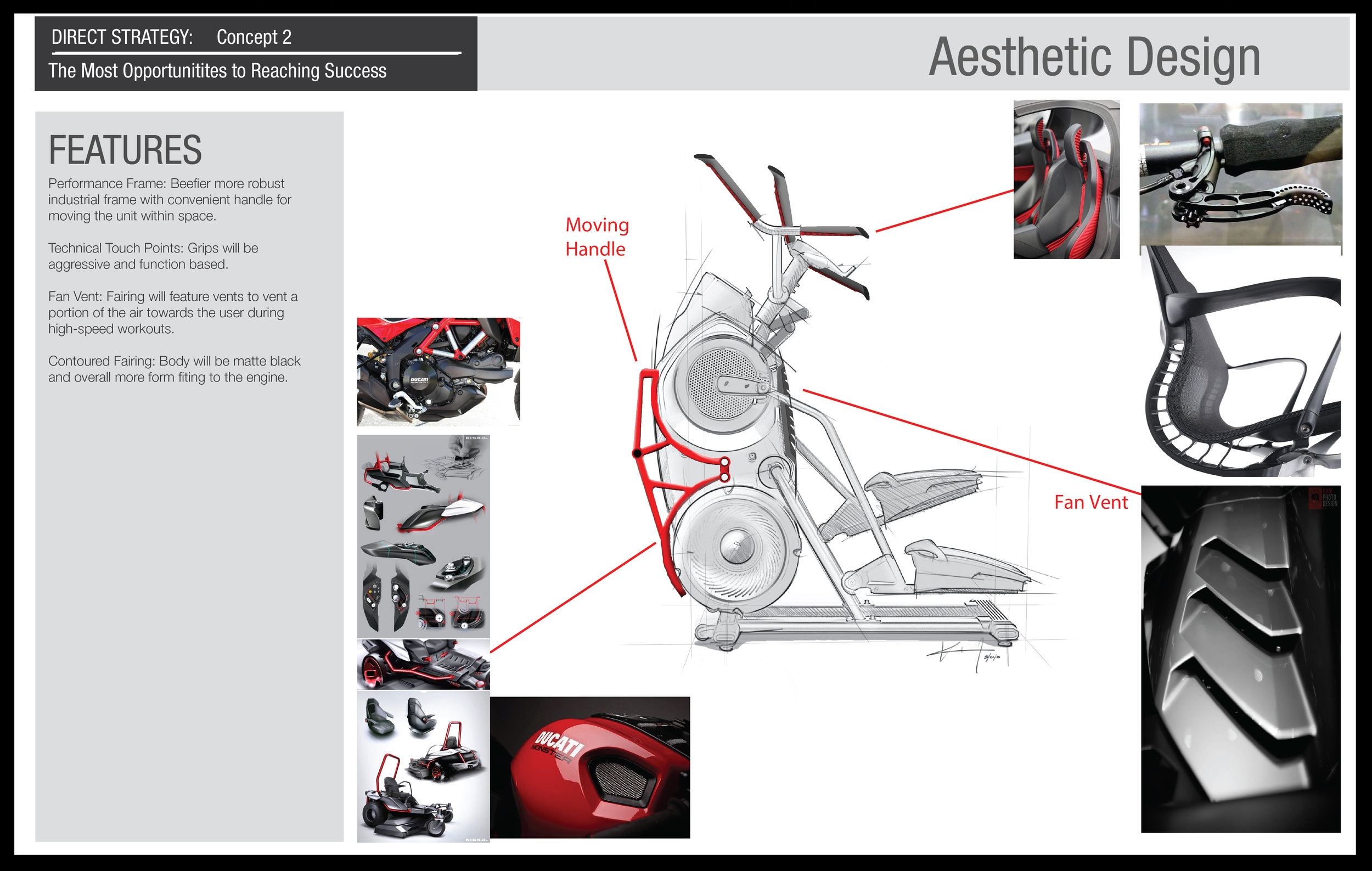
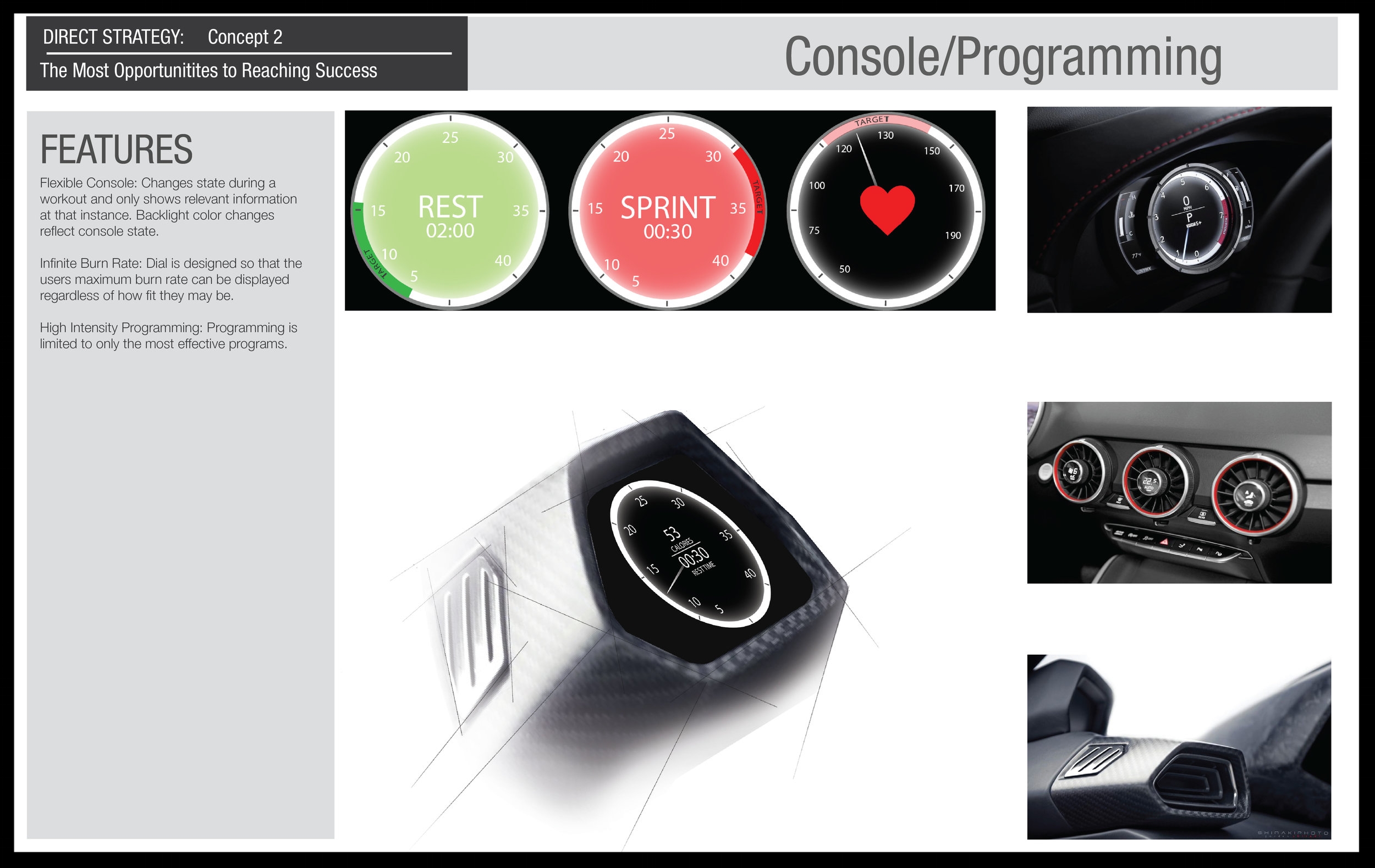
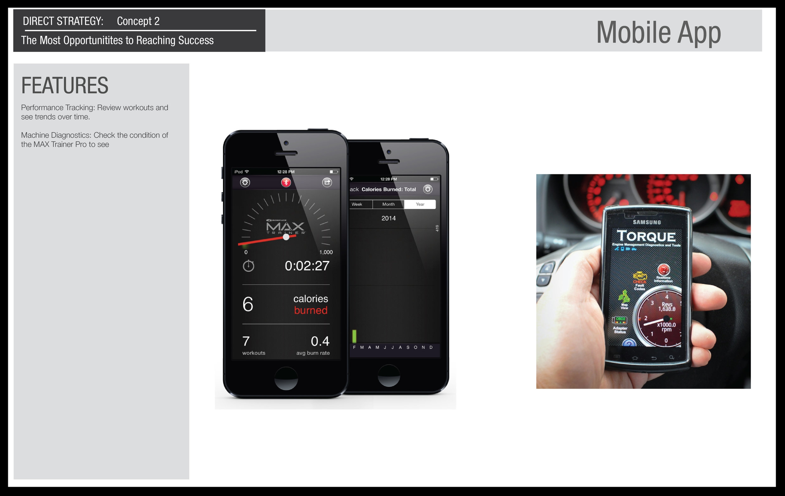
Concept 2 was meant to highlight and further call out the Ducati performance cues which originally inspired the designer who created the first generation of the MAX Trainer. Owners were definitely inspired by the aggressive styling of the MAX Trainer. This concept focused on being more premium with design elements which were more performance oriented. Features included a metal rack to assist in moving the product, a dynamic full color LCD console, and an app that helped monitor progress in terms of power output but also the usage of the machine. All of this to make the product experience more like owning a performance motorcycle.
Additional Content on MAX
Check out the two links below to find out more about the original MAX Trainer User Research or to see the App Experience which I created to help better coach users through the experience of using the product.


